Tyler Conway Get link Facebook Twitter Pinterest Email Other Apps September 25, 2017 I really like this unusual logo. I like how the typeface goes around it. I think it would make great use for objects like stickers and pens. Read more
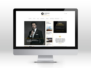
Tom Cavenau Get link Facebook Twitter Pinterest Email Other Apps September 25, 2017 I like the sleekness of this. I like the layout, color, and how the logo pops with the bright color against the black background. Read more
Robert Bazaeu Get link Facebook Twitter Pinterest Email Other Apps September 25, 2017 I like how the logo is actually the typeface. I like the color and the typeface itself. Read more
Peter Culkin Get link Facebook Twitter Pinterest Email Other Apps September 25, 2017 I like this mockup. I like the typeface and the logo. I think it could definite stand on its own. Read more
Michael Barney Get link Facebook Twitter Pinterest Email Other Apps September 25, 2017 I like the color of this. I also like how it can stand alone. I like the organic shape. Read more
Ian Winfield Get link Facebook Twitter Pinterest Email Other Apps September 25, 2017 I like how the design is almost a 3D effect. I like the simplicity. I also like how the type is in in white. Read more
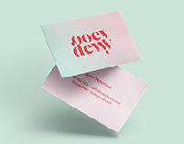
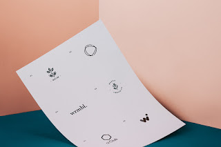
David Moncado Get link Facebook Twitter Pinterest Email Other Apps September 25, 2017 I love the light pink. I also like the layout on this one and how it is photographed. I like how it is simple. Read more
Barbara Siewert Get link Facebook Twitter Pinterest Email Other Apps September 25, 2017 I really like the layout on these. I like the color combinations. The white type is great. Read more
Amin Zaman Get link Facebook Twitter Pinterest Email Other Apps September 24, 2017 I really like the shape of this. I like the color family that is used. Read more
Alex Seymour Get link Facebook Twitter Pinterest Email Other Apps September 24, 2017 I love the simplicity of this. I also like the colors. They are not normal. Read more
Victo Ngai Get link Facebook Twitter Pinterest Email Other Apps September 17, 2017 I like this because the type is placed well with the image. Read more
Steve Simpson Get link Facebook Twitter Pinterest Email Other Apps September 17, 2017 I like the fun aspect of this. I like the typeface. Read more
Shanti Sparrow Design Get link Facebook Twitter Pinterest Email Other Apps September 17, 2017 I like the layout and I think it works well together. Read more
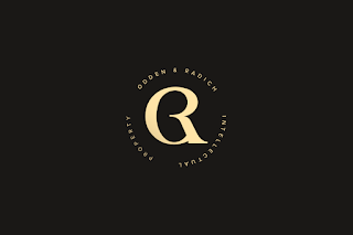
Sebastian Bednarek Get link Facebook Twitter Pinterest Email Other Apps September 17, 2017 I like the Q as the actual Logo. Read more
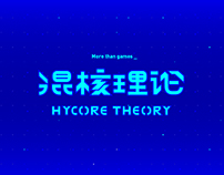
Phil Wu Get link Facebook Twitter Pinterest Email Other Apps September 17, 2017 I like the ombre effect. I also like the light blue against the dark blue. Read more
Paul Montana Get link Facebook Twitter Pinterest Email Other Apps September 17, 2017 I like the typeface and the intriguing design. Read more
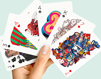
Patrick Seymour Get link Facebook Twitter Pinterest Email Other Apps September 17, 2017 I love the design of these cards. I love the patterns. Read more
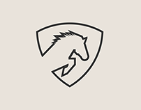
Michael Brant Get link Facebook Twitter Pinterest Email Other Apps September 17, 2017 I like how he uses simple lines to create a great design for a logo. Read more
Michael Barney Get link Facebook Twitter Pinterest Email Other Apps September 17, 2017 I like this simple logo. I think it works well. Read more
Juan Tide Get link Facebook Twitter Pinterest Email Other Apps September 17, 2017 I love the black on the yellow background. It really makes the image pop. Read more
Tom Cavenau Get link Facebook Twitter Pinterest Email Other Apps September 12, 2017 I like the circle effect. I like the black background against a light color. Read more
Sebastian Bednarek Get link Facebook Twitter Pinterest Email Other Apps September 12, 2017 I like this because he meshed a few things together! I also like the red and black together! Read more
Scott Natyan Get link Facebook Twitter Pinterest Email Other Apps September 12, 2017 This one is cool because of the shape. I like how it is very bold. Read more
Neil Gibson Get link Facebook Twitter Pinterest Email Other Apps September 12, 2017 I like how it is arranged on the page. I like the colors and the word choice he used. Read more
Marcus Hoang Get link Facebook Twitter Pinterest Email Other Apps September 12, 2017 I think this one is a cool visual with the spin of the brain and the word think. Read more
Julio Lopez Get link Facebook Twitter Pinterest Email Other Apps September 12, 2017 I like the colors and the visuals. They go well with the theme. Read more
Glasfurd and Walker Get link Facebook Twitter Pinterest Email Other Apps September 12, 2017 I like the typeface on this one. I like the background colors too! Read more
Ewa Wrembel Get link Facebook Twitter Pinterest Email Other Apps September 12, 2017 I like these because they are small and simple. They are straight to the point. Read more
Amin Zaman Get link Facebook Twitter Pinterest Email Other Apps September 12, 2017 I like the gold with the navy. I also like how there are no word with the logo and it stands by itself. Read more
Alex Seymour Get link Facebook Twitter Pinterest Email Other Apps September 12, 2017 I really like the visual of this. I like the simplistic of this. Read more
Steve Dorado Get link Facebook Twitter Pinterest Email Other Apps September 11, 2017 I like how flat this looks. The colors do not over power and it adds alot to the image. Read more
Rutger Paulusse Get link Facebook Twitter Pinterest Email Other Apps September 11, 2017 I like how this is different and uses shapes to create the piece. I like the colors and the shadows. Read more
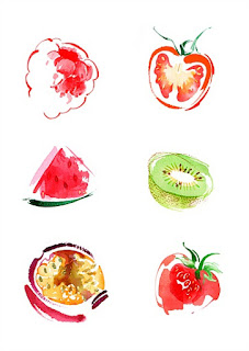
Ollie Maxwell Get link Facebook Twitter Pinterest Email Other Apps September 11, 2017 I really like how water painty this looks like. I like the use of colors he uses to portray shadows. Read more
Marc Kohn Get link Facebook Twitter Pinterest Email Other Apps September 11, 2017 I like the angle and the texture of this image. Read more
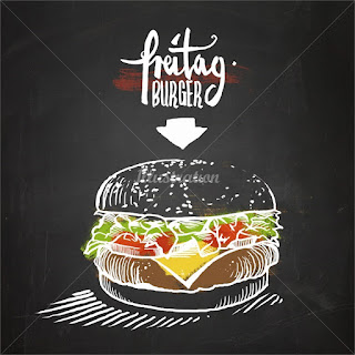
Lukas Bischoff Get link Facebook Twitter Pinterest Email Other Apps September 11, 2017 I like the colors vs. white it makes it look like a chalkboard and it looks cool!! Read more
Katherine Asher Get link Facebook Twitter Pinterest Email Other Apps September 11, 2017 This reminds me of the 60 for 60 drawings. I like the colors very much. I like the use of white space. Read more
Duncan Beedie Get link Facebook Twitter Pinterest Email Other Apps September 11, 2017 I think this is so creative. I like the texture feel to this. I also like how he uses brown but it doesn't over power it. Read more
Chris Gilleard Get link Facebook Twitter Pinterest Email Other Apps September 11, 2017 This is so funny. I love the big shapes that make up this image. I like how it is positioned and i like the colors. Read more
Amber Day Get link Facebook Twitter Pinterest Email Other Apps September 11, 2017 I love how this is positioned on the page. I like the sketchy feel. This is like the 60 for 60 drawings. I like the typeface. Read more
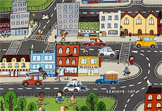
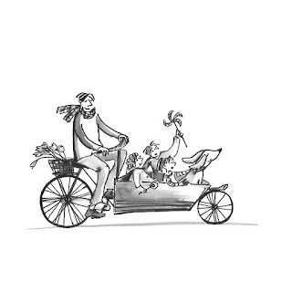
Alyana Cazalet Get link Facebook Twitter Pinterest Email Other Apps September 11, 2017 I like how it is black and white and how it is very sketchy like. I love the dog in the front. It is very cute. Read more
Ryan Lau Get link Facebook Twitter Pinterest Email Other Apps September 11, 2017 I like the visuals within the text. Also the bright colors are eye-catching for the event. Read more
Peter Culkin Get link Facebook Twitter Pinterest Email Other Apps September 11, 2017 I like how the use of letters is in the actual design. I like the monochromatic look. Read more
Paul Montana Get link Facebook Twitter Pinterest Email Other Apps September 11, 2017 I really like the visual in this picture. I think it works well with this typeface. Read more
Micheal Brant Get link Facebook Twitter Pinterest Email Other Apps September 11, 2017 I really like how simple this one is. I also like the few colors it uses because it is still vibrant and eye catching. Read more
Martin Servantes Get link Facebook Twitter Pinterest Email Other Apps September 11, 2017 I like how it uses a wave in the typeface. I also like how the word is used as the actual logo. Read more
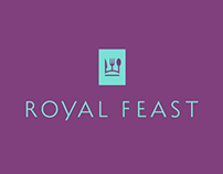
Julian Nozoe Get link Facebook Twitter Pinterest Email Other Apps September 11, 2017 I really like this one because the fork and the spoon visual. I like how this flows. Read more
Ian Winfield Get link Facebook Twitter Pinterest Email Other Apps September 11, 2017 I like the color scheme. I like the white against it and how its inverse. Read more
Ha Truong Get link Facebook Twitter Pinterest Email Other Apps September 11, 2017 I like the color and the visuals. I like the flow because it all seems to bother. Read more
Dex Walberg Get link Facebook Twitter Pinterest Email Other Apps September 11, 2017 I like how intriguing this one is. It uses simple shapes to make a cool logo. Read more
David Moncado Get link Facebook Twitter Pinterest Email Other Apps September 11, 2017 I like this because it is simple but yet effective. I like how it is fun and not formal. I like the script writing. Read more