I really like when logos can stand alone without text and I think this can do that same thing. I really like the orange background to it to make it pop.
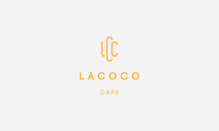
I like how the typeface is in this logo. I like the one stripe of the yellow it adds a great affect. I really like how it uses the visual with the font.
Works in Brazil. This was for a gelato shop. Like the use of typeface and how it covers the whole bowl. The two colors work well together when they usually don't.
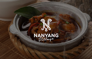
Le Tuan Binh, digital artist and designer, working in web design, brand identity and print media. He is working in Vietnam. Really like this use of the N and Y and not look like the average letters.
Meat Bun. Fast Food Branding. Creative with food packaging and branding. Fun and colorful. Likes to flow within the page, a lot with in but not clutter.
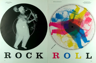
http://www.designishistory.com/1960/bradbury-thompson/ Bradbury did literally everything under the sun. He created the Washburn Bible. He also created a publication of Alphabet 26. He used layering a lot.